Densenet, Pneumonia Detection, Activation Maps and AUROC
I came across ChexNet when I was implementing the Pneumonia Detection model for the RSNA Kaggle challenge. Although I didn't implement Chexnet for the challenge, I was interested in doing that in the future. Once I was done with the Protein Detection challenge, I started looking into that.
Chexnet is basically Densenet, implemented for detecting various pathologies in Chest X-rays. Hence the name Chexnet. Densenet is a popular neural network architecture, along the lines of ResNet, Inception etc. The dataset used for Chexnet was the NIH dataset.
The paper implementing Chexnet tested their model specifically on detecting Pneumonia like features. They compared the model's performance against some radiologists, the F1 score being the determinant of performance. Going by the F1 score alone, it seemed as though the model performed better than the radiologists. But the devil's is in the details.
I came across this excellent post by a radiologist/ml engineer. He's explained the model's shortcomings as well as the good things that it did. Along with some other posts that he wrote, he basically says that the dataset is flawed and that the paper should have included more stats to really put the model's performance into perspective. He also says that even though the dataset is flawed, the machine learning aspect is sound.
One of the more interesting statistics that he mentioned was necessary for checking a model's performance was AUROC or Area Under ROC (Receiver Operating Characteristic). It's generally obtained by plotting Sensitivity against 1 - Specificity. The area under ROC curve is an estimate of how well the model is able to separate positive and negative labels. If the AUROC value is 0.5, then the model is no better than guessing randomly. A high AUROC of say 0.9 and above means the model is able to separate the labels correctly 90% of the time.
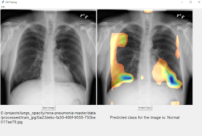
I wanted to find out the ROC value for a chexnet model myself. I found this code for chexnet written in Keras and adapted it to the RSNA Kaggle pneumonia dataset and added a few ideas of my own as well. The RSNA dataset was itself a subset of the NIH dataset but with additional labeling performed by radiologists. I wanted to see how well my model would do on that dataset. I also wanted to check out the class activation maps (CAM) that were presented in the paper. The keras code that I found wasn't giving the class activation output so I had to tinker with it to make it work. Class activation maps is a way to 'see' what the neural network is 'seeing' when making an inference.
I had a training, dev and test set. At each epoch after going through the training set, the AUROC of the dev set was calculated. I stopped training when the dev loss started diverging. On the dev set I managed to get a score of 0.963. On the test set, I initially got an AUROC score of 0.69. After some more data augmentations and after adding histogram equalization I managed to push it to 0.73. Which meant that the performance was good but not great since it's nowhere near to 0.9 or above. A bigger training set with more diverse Pneumonia data would definitely improve that score.
Above is a collection of cam outputs. Everything on the left of the vertical red line is a correct estimate of presence or absence of pneumonia. On the right of that line are wrong guesses i.e the model predicted pneumonia where none existed and vice versa.
In the correct predictions in the images above, the top row is the one that the model predicted the presence of pneumonia. The blue rectangles are radiologist estimates of where pneumonia is present in the lungs and the multicolored areas are the model predictions for the same. We can see that in the correct predictions they overlap indicating the model is able to 'see' pneumonia in the same way as a radiologist.
In the bottom row of correct predictions, we can see that the model excludes the lungs areas, which is the same as saying that it is unable to find pneumonia like features in those areas.
For incorrect predictions, in images where there's not much activation, it's supposed to predict Pneumonia but it predicts 'Normal' meaning those are False Negatives. In the brightly colored images, it's the opposite, meaning those are False Positives.
WHAT I LEARNT:
GITHUB here: https://github.com/varunvprabhu/chexnet_aurocWHAT I LEARNT:
- The github code that I borrowed and customized had a great data generator for Keras that used both multitprocessing and data augmentation.
- Freezing the model after loading imagenet weights for an epoch and then unfreezing all the layers led to a faster convergence.
- More augmentations and regularization gave me better results with respect to AUROC scores.
- CAM outputs made it easier to see what the neural network was seeing.

Comments
Post a Comment